Today one of the biggest IT company Google had changed its logo. Google has changed a lot over the past 17 years—from the range of our products to the evolution of their look and feel. And today Google is changing things up once again. Once upon a time, Google was one destination that you reached from one device: a desktop PC. These days, people interact with Google products across many different platforms, apps and devices—sometimes all in a single day. You expect Google to help you whenever and wherever you need it, whether it’s on your mobile phone, TV, watch, the dashboard in your car, and yes, even a desktop.
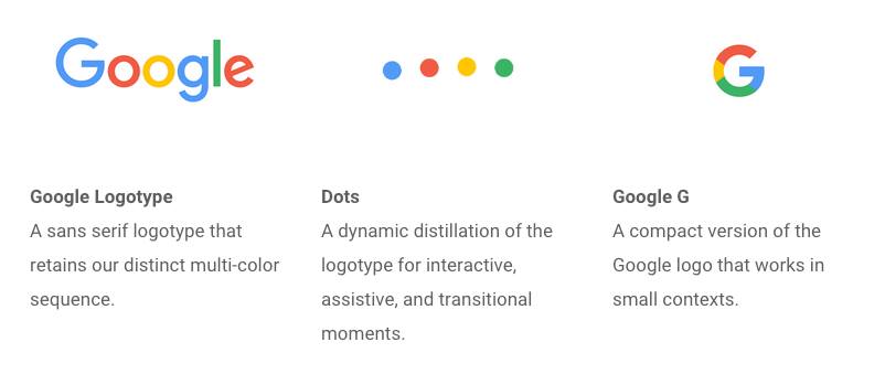
Google New Logo With Dots & G Details
Google Logotype : A sans serif logotype that retains our distinct multi color sequence.
Google Dots : A dynamic distillation of the logotype for interactive, assistive and transitional moments.
Google G : A compact version of the Google logo that works in small contexts.
The company said the redesign was meant to reflect the way that people interact with Google products across many different platforms, apps and devices.
“It doesn’t simply tell you that you’re using Google, but also shows you how Google is working for you. For example, new elements like a colorful Google mic help you identify and interact with Google whether you’re talking, tapping or typing. Meanwhile, we’re bidding adieu to the little blue ‘g’ icon and replacing it with a four-color ‘G’ that matches the logo.”
The logo has undergone many, mainly small, changes in its history. The colors have changed, 3D letters have been flattened, and an exclamation point came and went in 1999.
The logo changed just a month after a major restructuring of the company was unveiled. Google is now owned by Alphabet, a holding company created by founders Sergey Brin and Larry Page to separate their money-making search engine company from the loss-making, “moon shot” projects like robot cars, medical research and internet-delivering balloons.
Source : GoogleBlog

Leave a Reply